前言
项目地址: axionl/OhMyQt
- 项目在 Windows 11 和 ArchLinux 下进行测试
- Qt 版本: 5.15.2
本文以项目构建的角度介绍一个简单 Qt 应用的开发,其余具体的环境安装和配置稍后会在第 0 节内容中放出。
从看见到设计
我们需要一个简单的展示页面作为上手的第一个项目:
- 一个醒目的标题
- 一段用于描述的文字
- 还有一个好看的背景
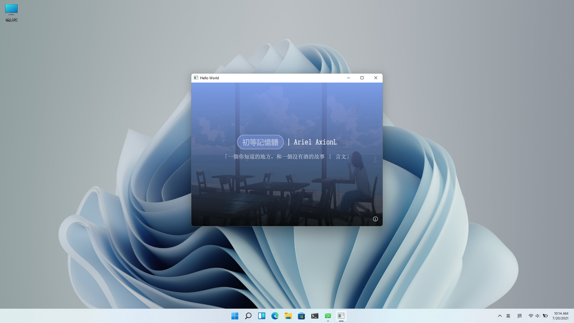
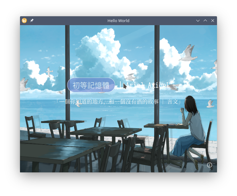
假设我们已经做了出来,它长下面这个样子,你需要做的是把它保留在你的想象中,我们再回过头来考虑如何实现。
布局
我们把窗口想象成一个盒子(而不是一个平面或者一张桌子,因为盒子横看有四壁,俯瞰有纵深),而所需要填入的内容当成另一个小些的盒子,套入到窗口这个大盒子中。结合我们多年糊 PPT 的水平,可以对界面有如下设计要求:
- 内容整体居中
- 标题和描述上下排布
- 内容之间最好有一定的间距
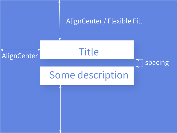
如上图所示,我们把这一些要求的集合称为 “布局” 也即 Layout,它决定了我们软件设计的基本框架。上面的每一项具体内容称为 “元素” 即 Element / Item。有的人设计 PPT 的时候会说:“应甲方要求,标题一定要大!”,那这属于元素的“属性”,即 Property。于是我们来抽象实现一下这个布局(注意不是直接能用的代码):
1
2
3
4
5
6
7
| // 基本元素如下
Window { // 窗口一个大盒子
Box { // 里面套个小盒子
Title {} // 盒子里面有标题
Description {} // 标题下面有描述
}
}
|
进一步加上居中对齐和间距:
 1
 2
 3
 4
 5
 6
 7
 8
 9
10
11
12
13
| Window {
Box {
anchors.centerIn: parent // 居中对齐大盒子
Title {
anchors.horizontalCenter: parent.horizontalCenter // 水平对齐小盒子
}
Description {
anchors.horizontalCenter: parent.horizontalCenter // 水平对齐小盒子
}
}
}
|
可以看到,这里引用了一个 parent 的概念,实际上指代上一层父级元素,套娃套在里面的才是娃,文字和描述的父级元素是小盒子,小盒子的父级元素是大窗口。再补上元素的属性和间距:
 1
 2
 3
 4
 5
 6
 7
 8
 9
10
11
12
13
14
15
16
17
18
19
20
21
22
23
24
25
| Window {
width: 960 // 窗口宽度
height: 720 // 窗口高度
Box {
anchors.centerIn: parent
implicitWidth: 360 // 宽度 360 单位(多数情况下理解为像素)
implicitHeight: 128 // 高度 128 单位
Title {
anchors.horizontalCenter: parent.horizontalCenter // 水平对齐小盒子
font.pixelSize: 24 // 标题一定要大
}
Box {
visible: false // 一个看不见的盒子
implicitHeight: 16 // 用于拉开标题和描述的间距
}
Description {
anchors.horizontalCenter: parent.horizontalCenter // 水平对齐小盒子
font.pixelSize: 16 // 精致的描述用小字
}
}
}
|
这些具体元素我们以后会写到如何实现,现在需要用 QtQuick.Controls 提供的一些默认元素替代:
- Box->Rectangle
- Title / Description -> Text
 1
 2
 3
 4
 5
 6
 7
 8
 9
10
11
12
13
14
15
16
17
18
19
20
21
22
23
24
25
26
27
28
29
30
31
32
33
34
| import QtQuick 2.12
import QtQuick.Window 2.12
import QtQuick.Controls 2.12
Window {
width: 960
height: 720
Rectangle {
anchors.centerIn: parent
implicitWidth: 360
implicitHeight: 128
color: "#ef7e9ceb"
Text {
id: title
anchors.horizontalCenter: parent.horizontalCenter
text: "这是一个大标题"
font.pixelSize: 48
}
Rectangle {
color: "transparent"
implicitHeight: 16
}
Text {
id: description
anchors.horizontalCenter: parent.horizontalCenter
text: "我吞下玻璃会伤身体"
font.pixelSize: 24
}
}
}
|
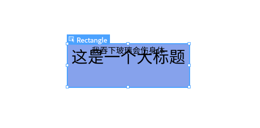
实现之后的效果可能长成了这个样子,对了,但没全对。因为我们这个 Rectangle 不太智能,是个“硬盒”,元素之间会挤在一起,而不是自动拉开保持社交距离。
 1
 2
 3
 4
 5
 6
 7
 8
 9
10
11
12
13
14
15
16
17
18
19
20
21
22
23
24
25
26
27
28
29
30
31
32
33
34
35
| import QtQuick 2.12
import QtQuick.Window 2.12
import QtQuick.Controls 2.12
import QtQuick.Layouts 1.12
Window {
width: 960
height: 720
Rectangle {
anchors.centerIn: parent
implicitWidth: 360
implicitHeight: 128
color: "#ef7e9ceb"
ColumnLayout { // 一个上下布局的模板
anchors.fill: parent // 沾满小盒子的空间
spacing: 16 // 原先看不见的盒子用默认提供的间距属性实现
Text {
id: title
Layout.alignment: Qt.AlignHCenter | Qt.AlignVCenter // 换成 Layout 下的居中对齐模式
text: "这是一个大标题"
font.pixelSize: 48
}
Text {
id: description
Layout.alignment: Qt.AlignHCenter | Qt.AlignVCenter
text: "我吞下玻璃会伤身体"
font.pixelSize: 24
}
}
}
}
|
可以把 ColumnLayout 当作一个更加智能的盒子,它能够把挤在一起的元素上下依次排开。而与之相对的 RowLayout 则是将元素左右排开。
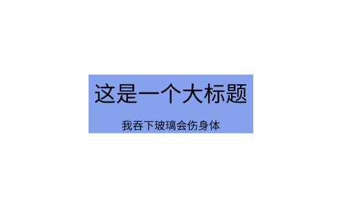
对比原本想像中的布局要求,可以说是基本实现了(打个九折不过分吧)。
样式
基本的元素提供了默认的样式和属性,回顾想象图目前还缺少:
以一个基本的矩形为例,有如下常用属性(QtQuick-Rectangle)
 1
 2
 3
 4
 5
 6
 7
 8
 9
10
| import QtQuick.Controls 2.12
Rectangle {
width: 16
height: 16
radius: 8 // 圆角半径
color: "white" // 颜色
border.width: 1 // 边框宽度
border.color: "whitesmoke" // 边框颜色
}
|
带阴影的矩形可以这样实现:
 1
 2
 3
 4
 5
 6
 7
 8
 9
10
11
12
13
14
15
| import QtQuick.Controls 2.12
import QtGraphicalEffects 1.0 // 包含 DropShadow 效果
Rectangle {
// ...
layer.enabled: true
layer.effect: DropShadow {
horizontalOffset: 1 // 横向偏移
verticalOffset: 1 // 纵向偏移
radius: 16 // 阴影半径
samples: 17 // 采样率(越高效果越好,性能消耗也增大)
color: "#10000000" // ARGB(透明度,红,绿,蓝)
}
}
|
为矩形添加渐变色:
 1
 2
 3
 4
 5
 6
 7
 8
 9
10
11
12
13
14
15
16
17
18
| Rectangle {
// ...
rotation: 0 // 渐变角度
gradient: Gradient {
GradientStop {
position: 0
color: "#ef7e9ceb" // 起始颜色
}
// 可以添加多段
GradientStop {
position: 1
color: "#c5000000" // 结束颜色
}
}
}
|
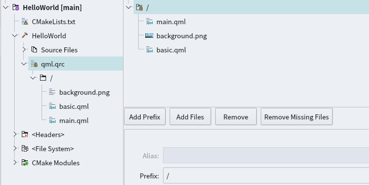
qml.qrc 文件中管理所有的静态资源,可以右键在编辑器中打开,然后添加图片资源:
 1
 2
 3
 4
 5
 6
 7
 8
 9
10
11
12
| Rectangle {
id: background
// ...
Image {
anchors.fill: background // 填充背景矩形
source: "qrc:/background.png" // 图片资源
fillMode: Image.PreserveAspectCrop // 填充方式
z:-1 // 由于需要将渐变色作为滤镜效果,所以图片的层级下调
}
}
|
如果去掉 z 轴高度设置会发现渐变色在图片下层不可见:
事件和交互
事件触发
虽然 QtQuick.Controls 中提供了 Button 控件,但是我们仍然可以先为自己创立一个简单的按钮,通过鼠标点击这一事件理解其基本实现。
 1
 2
 3
 4
 5
 6
 7
 8
 9
10
11
12
13
14
15
16
17
18
19
20
21
22
23
24
25
26
27
28
29
30
31
32
33
34
35
36
37
| Rectangle {
id: button
implicitHeight: 48
implicitWidth: 156
radius: implicitHeight / 2
border.color: "white" // 边框颜色
color: "#ef7e9ceb" // 背景颜色
Text {
anchors.verticalCenter: parent.verticalCenter // 居中对齐
anchors.horizontalCenter: parent.horizontalCenter
text: "初等記憶體" // 文字内容
color: "white" // 文字颜色
}
// 大小和位置覆盖全按钮的鼠标动作区域
MouseArea {
anchors.fill: parent
Layout.alignment: Qt.AlignHCenter | Qt.AlignVCenter
hoverEnabled: true // 允许响应鼠标停留
onEntered: {
parent.color = Qt.lighter(button.color, 0.8); // 进入颜色变深
parent.opacity = 1.0; // 不透明
}
onExited: {
parent.color = Qt.lighter(button.color, 0.9); // 退出颜色变浅
parent.opacity = 0.7;
}
onClicked: {
parent.color = Qt.lighter(button.color, 1.1); // 点击颜色变亮
}
}
}
|
Qt.lighter() 和 Qt.darker()是 color 属性内置的两个方法,用于相对调整颜色的深浅。运行时,鼠标放到按钮上方即可看见按钮颜色变化。
darker-method | lighter-method
这里有一个常见用法可以将需要设置的属性用 property 暴露出来,这样便于统一设置和更改,以及将来要写自己组件时便于外部设置,使用 state 可以提供若干个对象默认状态进行切换,这部分后面会见到。
1
2
3
4
5
6
7
| Rectangle {
// ...
property string buttonColor: "#ef7e9ceb"
property string buttonText
color: buttonColor // 引用属性值
}
|
事件交互(响应)
那么如何使得按钮能够响应我需要的事件呢,比如说点击按钮后用系统默认浏览器打开一个网址:
1
2
3
4
5
6
7
8
9
| Rectangle {
property string url: "https://axionl.me"
text: "ClickMe!"
onClicked: {
openURL(url); // 我们需要实现一个形如这样的方法
}
}
|
好在作为一个常见功能,QML 已经将其置为默认对象的方法之一,点击后即可调用默认浏览器打开所设置的网址
openUrlExternally-method
1
2
3
4
5
6
7
8
9
| Rectangle {
property string url: "https://axionl.me"
text: "ClickMe!"
onClicked: {
Qt.openUrlExternally(url); // 使用默认提供的方法
}
}
|
自定义类型和方法
在 C++ 中先写一个基于 QObject 父类的类对象,并实现所需的方法。
 1
 2
 3
 4
 5
 6
 7
 8
 9
10
11
12
13
14
| // my_button.hpp
class MyButton : public QObject
{
Q_OBJECT
public:
explicit MyButton(QObject *parent = nullptr) {};
Q_INVOKABLE void openUrl(const QUrl& url) {
bool err = QDesktopServices::openUrl(url);
if (err) {
qDebug() << "Failed to open url";
}
};
};
|
我们用 Q_INVOKABLE 宏声明了一个可以被外部调用(指 QML 中用 javascript 调用)的方法 void openUrl(const QUrl& url)。
QDesktopServices
|
该方法是对 QDesktopServices 类中打开链接方法的套用,其在不同平台下其会调用系统浏览器来打开链接。当然也可以自行实现,比如 Linux 平台如果装了 extra/xdg-utils 可以利用 xdg-open 来打开链接。
 1
 2
 3
 4
 5
 6
 7
 8
 9
10
11
12
13
14
15
16
17
18
| // main.cpp
import "my_button.hpp"
int main(int argc, char *argv[])
{
QGuiApplication app(argc, argv);
// ...
// 声明自定义对象
qmlRegisterType<MyButton>("MyApp", 1, 0, "MyButton");
// ...
QQmlApplicationEngine engine;
return app.exec();
}
|
简单注册如上,qmlRegisterType<类名>("包名", 主版本号, 次版本号, "对象名");,然后在所需的 qml 文件中引入。
 1
 2
 3
 4
 5
 6
 7
 8
 9
10
11
12
13
14
15
16
17
18
| import MyApp 1.0
Item {
// 以对象名为组件名
MyButton {
id: myButton // 实例化对象
}
Rectangle {
property string url: "https://axionl.me"
text: "ClickMe!"
onClicked: {
myButton.openUrl(url); // 使用自己实现的方法
}
}
}
|
也可以先在 C++ 中实例化一个对象,再传入对象引用。
 1
 2
 3
 4
 5
 6
 7
 8
 9
10
11
12
13
14
15
16
17
18
19
20
21
22
| // main.cpp
import "my_button.hpp"
int main(int argc, char *argv[])
{
QGuiApplication app(argc, argv);
// ...
// 实例化一个对象
MyButton my_button;
// ...
QQmlApplicationEngine engine;
// 传入对象引用
engine.rootContext()->setContextProperty(QStringLiteral("myButtonObject"), &my_button); // 全局使用时,设置唯一名称
return app.exec();
}
|
此时我们不再需要注册声明该对象,也无需在 QML 中引入和实例化,而是直接调用该对象的方法。
1
2
3
4
5
6
7
8
9
| Rectangle {
property string url: "https://axionl.me"
text: "ClickMe!"
onClicked: {
myButtonObjecton.openUrl(url); // 直接调用对象方法
}
}
|
小结
至此已经实现了 Demo 的全部功能:
本节基本介绍了 QML 的组织结构和简单事件交互的实现方法,下一节将以一个新的例子来介绍信号量和信号槽这一对重要的概念,以及 C++ 后端代码到 QML 的数据绑定实现。
另外还建立了个人讨论群方便大家互相交流: https://t.me/Qt_CN
![Featured image of post [OhMyQt 系列] 01_HelloWorld](/p/ohmyqt-%E7%B3%BB%E5%88%97-01_helloworld/banner_hu2b2e55908b8d26e47274f4f94447b3fd_141327_800x0_resize_box_3.png)